The Rockwellist App
UI/UX Designer & Product Manager · Devbox Solutions for Rockwell Land Corporation · 2021 – Present
Some materials are shared with client permission. Screens have been abstracted where required. Happy to walk through the full project in a conversation . Feel free to get in touch!
I’ve been the lead designer of the Rockwellist App across two distinct phases: Its original launch in 2021, and a comprehensive re-architecture in 2024 after being brought back by Devbox Solutions to rebuild what I originally designed. This is a retail mobile platform serving one of the Philippines' most prestigious luxury real estate and retail property developers.
Platform Impact To Date
114K +
Active Users, Since Launch
Php 8B
Loyalty-driven Platform Sales
30%
YOY Growth Sustained
+22%
User Engagement upon relaunch
+61%
Loyalty Program Participation
Discovery
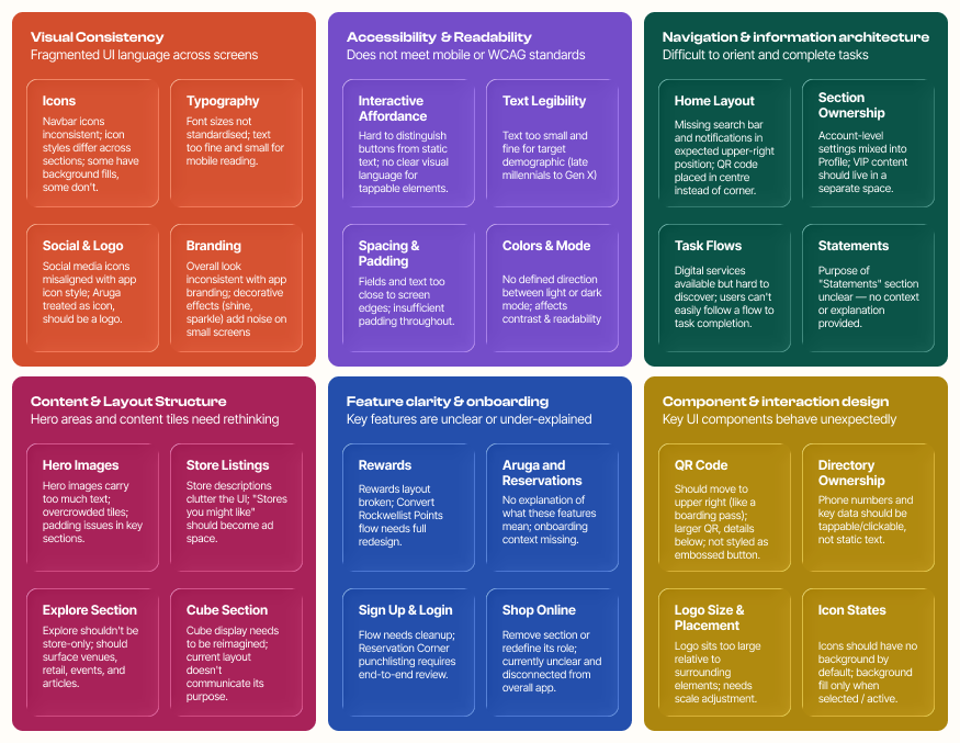
Before touching a frame in Figma, I needed to understand what the platform had become versus what it was designed to be. A heuristic audit across all user flows, combined with structured interviews with the client's marketing team and loyalty program data, surfaced three pain points that shaped everything that followed:
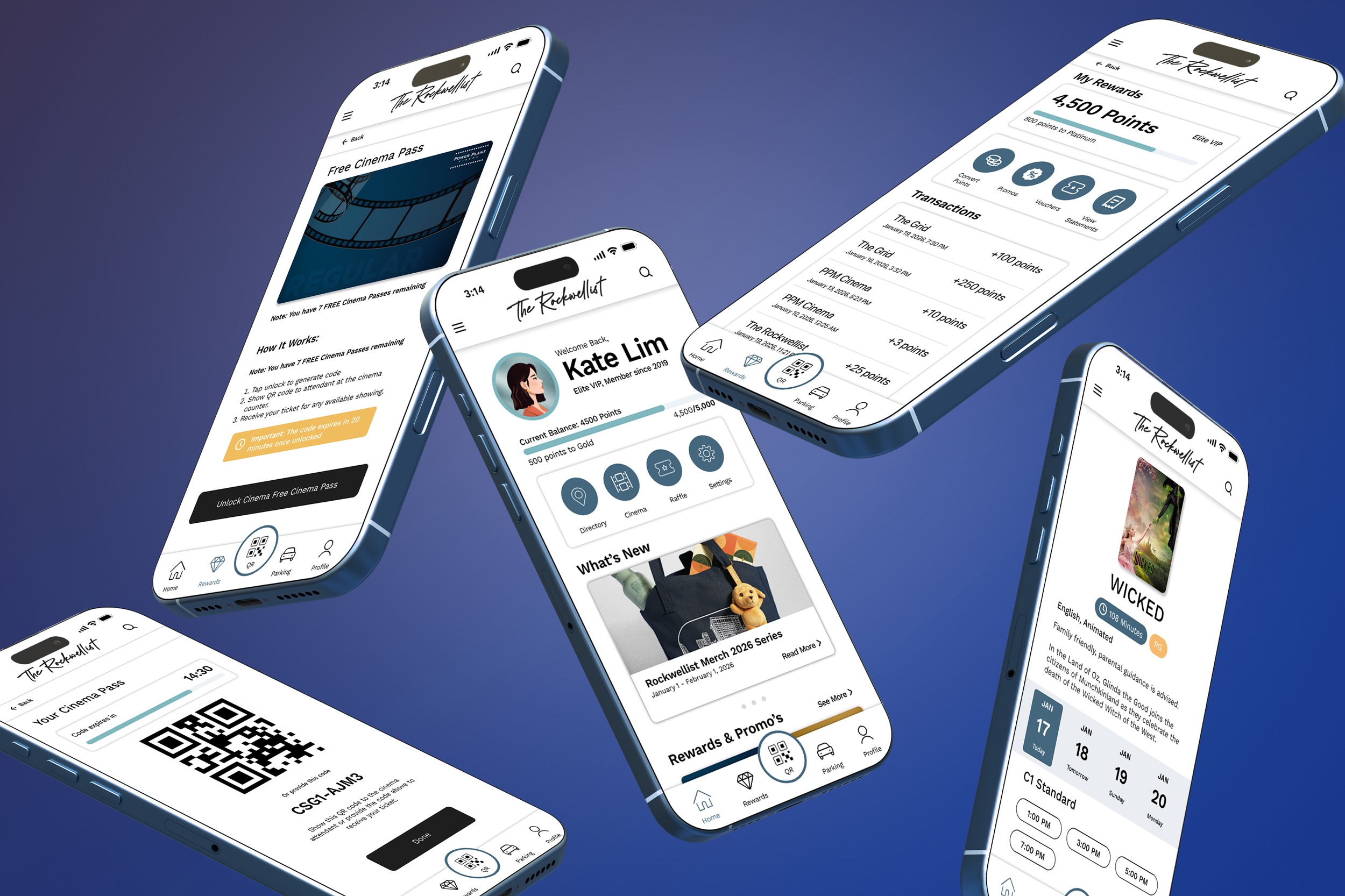
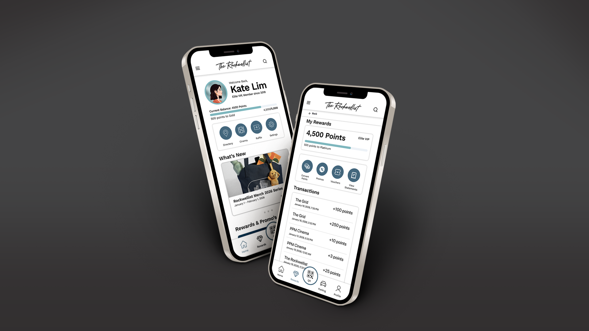
The loyalty program was buried in the navigation despite being the most-wanted feature.
Parking payment flows had high abandonment rates among the platform's older primary demographic.
Cinema ticketing was the highest-frequency use case but had significant mid-flow drop-off.
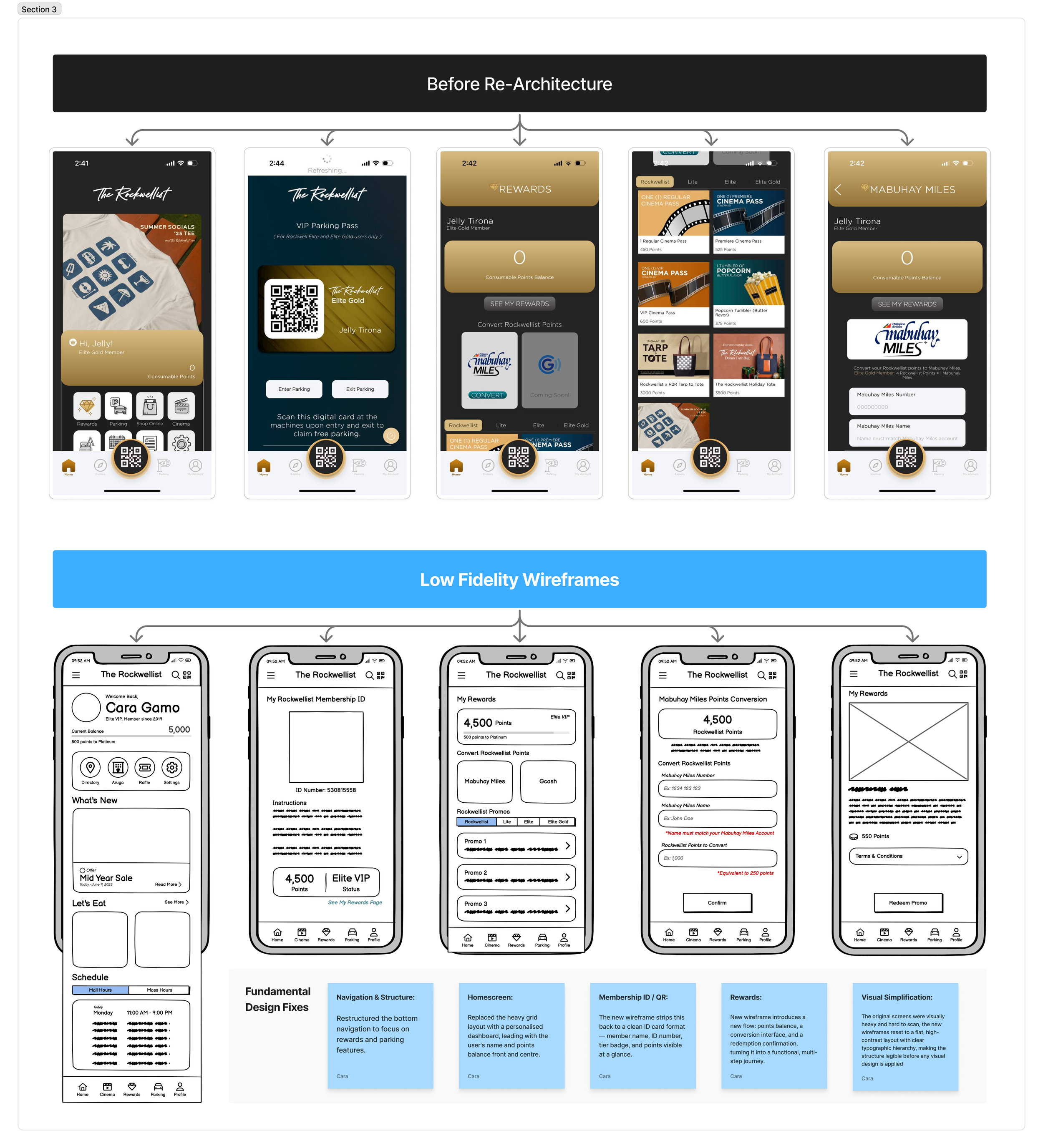
The core structural decision was rearchitecting the entire user journey from the loading screen forward, mapping every feature and function against the client's business objectives to ensure the app was working in service of their goals, not just existing as a digital brochure. This meant repositioning the rewards program and parking feature as primary, immediately accessible touch-points rather than buried sub-menus, directly optimising the platform for driven sales and repeat engagement.
Navigation was rebuilt around user intent:
Re-organising the information architecture so that the most commercially important features were the easiest to reach.
Reducing the cognitive load required to complete a task.
Every screen was evaluated against the user journey from first open to task completion, closing the gaps that had made digital services technically available but practically invisible.
Design Decisions
The redesign was brought into WCAG compliance through a simplified colour system, a clear visual hierarchy, and an interaction language where buttons, tappable elements, and static content were immediately distinguishable from one another. This was a critical fix for the late millennial to Gen X demographic who had been navigating an interface that gave them no reliable cues to act on.
Since relaunch, the client has received consistent positive feedback from regular users, with members who previously opened the app only to passively earn points are now actively returning to redeem promos and vouchers. The shift from passive earning to active redemption signals more than improved usability; it reflects a change in how users relate to the platform, with the redesign giving them enough confidence and clarity to actually explore and spend what they'd accumulated.
The numbers tell part of the story (114K users, PHP 8B in platform sales, +61% loyalty program participation), but what they represent is a platform that people stopped avoiding and started choosing. Members who once opened the app only to passively accumulate points are now actively redeeming, exploring, and returning. That shift from passive to active use doesn't happen because an interface looks better. It happens when the design gives people enough clarity and confidence to trust what they're doing.